Saturday, 31 October 2015
Why is sound so important in film?
Sound is important in film as it does things such as revealing the Genre of the movie. For example if a sort of high pitch instrumental is used, it normally has to do with a Horror or Thriller. If a slow low tune is used that could be associated with a Romance. Sound also helps keep the audience interested and makes them feel more involved. Above I have included the trailer of a Thriller named Reasonable Doubt. Watch the clip first without sound, and then a second time but turn the sound on. You are most likely less interested when the sound is not playing as you don't feel 'on the edge of your seat' compared to when the sound was turned back on. This is just a few reasons as to why sound is so vital in production.
Friday, 30 October 2015
Thursday, 29 October 2015
Wednesday, 28 October 2015
The MACRO, MICRO and order of title credits of a title sequences.
The Macro elements:
- Their isn't really a clear storyline in this title sequence. However their seems to be many figures covered in ink or paint whilst they move in time to the beat of the instrumental. It seems like whenever they try to speak or say something, another figure shatters them or a fist punches them in the face etc.
- I think the plot is that the characters are not able to speak. It's as if they have something vital that needs to be said but we are not allowed to hear it just yet.
The Micro elements:
- The main camera shots used tend to be close ups and long shots. The close ups used specifically show facial expressions especially from 1:43 - 1:46. On the other hand, the long shots show the whole picture and reveal more to the audience.
- The editing used makes the title sequence seem as if it isn't just based on one thing, but makes it seem as if many things are going on at once. The sound also goes along well with the editing. This is because as soon as one clip changes to the other, the sound also changes to suit the specific clip.
The order of the title credits:
- IDENT
- Production company
- The names of the two main characters : Daniel Craig & Rooney Mara.
- The name of the movie
- More credits
- Casting by....
- Costume Designer
- Co-Producers
- Sound Design by....
- Music by....
- Editors
- Production Director
- Director of Production
- Executive Production
- Produced by....
- Screenplay
- Director
Tuesday, 27 October 2015
Evaluation: Remake of the title sequence of Submarine
Strengths-
The practical remake activity for the film Submarine was successful. This is because:

We used black background because it is associated with silence.
Also, we added sound and managed to make a title-sequence that lasted over a minute. I believe our title sequence was successful because it had a similar idea to the original Submarine title sequence. This shows we never changed the theme of it but changed the presentation of it.
Weaknesses-
There were some weaknesses during our production of our remake. For example, we were not very clear with the locations and this was time consuming. If we planned exactly where to film we could have took more filming at different locations. Another weakness was that we never filmed in the exact locations as the original film. If we did this the title sequence would have been similar but in a positive way. For example, we filmed in a corridor when we should have filmed in a bedroom. Another weakness is that our titles are changing at a slower speed than the original titles. We could have reduced the time for the titles.
However, our title sequence remake of the film Submarine could have been improved. This is because:
-We could have added more and different scenery
-Changed text size, background or colour of the titles
-Added our own sound
We could have added different scenery than just roads and buildings. This was time consuming but we may could of identified a destination that was really different to the others. This might of been a green field or a park. We used different locations like the Submarine original title sequence which contained different destinations. But our chosen locations were not much different from each other. To improve we should have chosen different locations which were not very similar to each other. Also, these places could have been more associated with the theme of loneliness. In addition, we could of filmed on different days because the change in weather could of changed the theme of the locations.
Also, to improve our remake we could of changed the text size, background colour or text colour. This would of been different to the original title sequence, however our group decided to keep these similar because they suited with the theme of the film. For example, if we used white text on moving images then this would of not make the appearance simple and sound would of been needed. However, we could of used a different background colour, for example red or brown, or change the text size or colour.

For example, changing the background colour may add effectiveness and change the mood.
Another improvement which could have been made is recording our own narrator. Someone in our group could have record themselves rather than using the same narrator in Submarine. Also, we could of added our own sound. This would of make the remake different to the original.
Overall, our remake of the title sequence for the film Submarine was successful. We managed to film and product a title sequence which lasted over a minute. Also, we added sound, titles and different types of shots. However, we could of filmed in very different locations. Also, we could of changed the size and colour of the background/text.
The practical remake activity for the film Submarine was successful. This is because:
-We managed to create a title sequence which lasted over a minute
-Included credits
-Added sound
-Used different types of shots
As we filmed, we tried to use different range of shots. For example we used 3 close up shots, these were medium and normal close up shots. We decided to this after examining the title sequence for the film Submarine. Different ranged shots were taken at the character in Submarine, therefore we did the same because it made it similar and using different ranged close up shots made the title sequence effective. This is because it grabs the audiences attention and combines well with the characters actions. For example, when I(images below) looked at the camera, the shot was even closer taken at me in the last shot. This meant it would look more effective and and it suits with my actions. Furthermore, using different types of shots helped us build tension and these shots engaged well with the sound and facial expressions of the character. This was successful because it was similar to the shots in Submarine and gave the title sequence a theme.

Medium and normal close up shots are very effective to the theme. Also, they make the audience concentrate on specific things, in this case it was the characters eyebrows.


Medium and normal close up shots are very effective to the theme. Also, they make the audience concentrate on specific things, in this case it was the characters eyebrows.

Also, we included titles which were similar to the titles in Submarine. In submarine white text was used on plain background. The background was blue and the text used were white. We similarly used white text but black background. We decided to used a different colour because we believed black background will suit more with the theme. This is because darker colours are considered to engage more with silence.

We used black background because it is associated with silence.
Also, we added sound and managed to make a title-sequence that lasted over a minute. I believe our title sequence was successful because it had a similar idea to the original Submarine title sequence. This shows we never changed the theme of it but changed the presentation of it.
Weaknesses-
There were some weaknesses during our production of our remake. For example, we were not very clear with the locations and this was time consuming. If we planned exactly where to film we could have took more filming at different locations. Another weakness was that we never filmed in the exact locations as the original film. If we did this the title sequence would have been similar but in a positive way. For example, we filmed in a corridor when we should have filmed in a bedroom. Another weakness is that our titles are changing at a slower speed than the original titles. We could have reduced the time for the titles.
However, our title sequence remake of the film Submarine could have been improved. This is because:
-We could have added more and different scenery
-Changed text size, background or colour of the titles
-Added our own sound
We could have added different scenery than just roads and buildings. This was time consuming but we may could of identified a destination that was really different to the others. This might of been a green field or a park. We used different locations like the Submarine original title sequence which contained different destinations. But our chosen locations were not much different from each other. To improve we should have chosen different locations which were not very similar to each other. Also, these places could have been more associated with the theme of loneliness. In addition, we could of filmed on different days because the change in weather could of changed the theme of the locations.
Also, to improve our remake we could of changed the text size, background colour or text colour. This would of been different to the original title sequence, however our group decided to keep these similar because they suited with the theme of the film. For example, if we used white text on moving images then this would of not make the appearance simple and sound would of been needed. However, we could of used a different background colour, for example red or brown, or change the text size or colour.

For example, changing the background colour may add effectiveness and change the mood.
Another improvement which could have been made is recording our own narrator. Someone in our group could have record themselves rather than using the same narrator in Submarine. Also, we could of added our own sound. This would of make the remake different to the original.
Overall, our remake of the title sequence for the film Submarine was successful. We managed to film and product a title sequence which lasted over a minute. Also, we added sound, titles and different types of shots. However, we could of filmed in very different locations. Also, we could of changed the size and colour of the background/text.
Monday, 26 October 2015
Analysis of 3 title sequences of chosen genre
The Exorcist (1973)
The sequence beings with a regular shot of an ident, and then proceeds to continue to a still of the same exact ident, but in black and white. The use of the sudden change to a monochrome colour scheme, implies that the films themes may be somewhat dark. The main plot isn't explicitly introduced in this film's opening sequence, as we aren't given any overtly obvious indications or clues as to whom the main characters may be. We are only shown a number of locations which hint at where the film may take place. The sequence consists of simplistic editing that incorporates shots of locations and black screens (with the credits) fading in and fading out into the next shot. The first camera shot sees a panning overview of what appears to be a fairly large, suburban house, on a quiet street at night. This gives an indication that the plot may surround a character(s) who seems to be fairly wealthy and belongs to the middle class. The shot after that depicts what looks like a statue of the Virgin Mary in different location, which leads the audience to believe, that the plot also concerns matters of religion. This theme is revisited a couple seconds later on in the sequence as we a shot of the sun rising in a location that appears to have a warm climate, all the while we hear a Qur'an verse being recited in Arabic, hinting again at strong theme of religion.
(title credits in order)
(title credits in order)
A William Friedkin film
William Peter Blatty's
(TITLE)


William Peter Blatty's
(TITLE)


Insidious (2010)
This title sequence, unlike that of "The Exorcist", is one that incorporates strictly still images. This is aside from the first minute or so of the sequence, in which a small segment of the film's potential plot is revealed, as we see (what we can assume to be) two key characters make their first appearance. This is done using a panning, wide shot of the of a potential key location (a little boy's room), followed by a brief camera focus on our first character (the little boy). As the camera trails off our first character, it then unpredictably zooms into a seemingly random spot in the corner of the room, slowly and eerily revealing our second character; a dark, vague, entity figure, and of course, the genre of the film becomes abundantly clear (also helped by the unnervingly creepy instrumental, which consists of a sequence of utterly random, uncomfortably high and low notes) This is followed up by a simply-edited string of monochrome still images, (much like the "The Exorcist", fading in and out of each other) further giving an insight into important locations and props (we can understand its set in a average looking American household), alongside the title credits, no notably interesting camera shots are used. The title font is a "vampy" style font, in a blood-red hue, further adding to the creepy, spine-chilling themes of the film.
(title credits in order)
Stage 6 films
Alliance films
IM Global
Haunted Movies
a James Wan film
(TITLE)
Patrick Wilson
Rose Byrne
Lin Shaye
Ty Simpkins
Barbara Hershey
Leigh Wannell
Angus Sampson
Andrew Astor
Joseph Bishara
(casting by) Annie McCarthy
Kellie Gesell
(costume design) Kristin M. Burke
(music by) Joseph Bishara
(edited by) James Wan
Kirk Morri
(production designer) Aaron sims
(director of photography) John R.Leonetti
David M. Brewer
Halloween (1978)
Contrasting to the first two, "Halloween", features a strictly "titles on a black screen" style of editing for its opening sequence, accompanied by a simple, single moving image of a Jack-O-Lantern alongside the credits. The colour palette of the title sequence just as simply, consists of only two shades; black and orange - tying in with the title of the movie, as these two hues, are those most associated with the topic that the film evidently surrounds - so they work effectively in the title sequence at giving away the film's genre, as well as hitting at the film's context. With it being a simply edited title sequence, the most motion that occurs is that of the enlarging jack-o-lantern that grows bigger and takes up more space on the black screen as the title credits change, futher implying that themes of horror are present. All the while, an infamously suspenseful and chilling instrumental is playing, undoubtably one of the most well recognised horror movie instrumentals of all time.
(title credits in order)
IDENT
IDENT
Donald Pleasence
(director) John Carpenter
Debra Hill
Jamie Lee Curtis
Nancy Loomis
P J Soles
Charles Cyphers
Kyle Richards
Brian Andrews
(director of photography) Dean Cundey
(film editors) Tommy Wallace
Charles Bornstein
(music by) John Carpenter
(associate producer) Kool Lusby
(production manager) Don Behrns
The sub-genre varies in all of these films, and the same goes for thier title sequences, so it is crucial that the codes and conventions of their sub-genre are somewhat portrayed through their title sequence, so the audience at least gets some idea as to what they're about to watch.
Saturday, 24 October 2015
BFI statistics yearbook (research) Audiences
Audiences
Which age group made the largest proportion of cinema admissions in the UK?
- 15-24 year olds (making up 33% of cinema admissions)
Which comedy film was most successful with this age group?
- The Hangover part 3
Which film was most popular with the over 50's (what's the genre)?
- Quartet (drama)
Which genres were most popular with men?
-Action, Sci-Fi, Thriller and Comedy
Which genres were most popular with women?
-Drama (mainly)
UK films appealed most to which audience type?
-UK films appealed most to those of the age 45+
Which 3 films were most popular with the 7-14 age group?
-The most successful films amongst this age group (apart from One Direction -This is us) happened to all be animated films, proving that this genre is the most popular amongst this age group. The films were; Wreck-It Ralph , Despicable Me 2, and Monsters University
The 3 most popular films amongst the 35-44 age group were Frozen, The Croods, and Jack the Giant Slayer. Why might this be?
-It would make sense for animation to be amongst the most popular genre for this age group, as individuals belonging to this age group tend to usually have families and children that tend to be fairly young. This means that at such a young age, children tend to be accompanied by parents or carers to the cinema, and coincidently the adults are the ones who pay for the tickets bought.
Which 3 films were most popular with the 24-34 age group?
-Django Unchained, Fast and Furious 6, Rush
Which films were most popular with middle class audiences?
-(C1) Rush, Captain Phillips, Gravity
-(C2) Oz the Great and Powerful, Despicable Me 2, Fast and Furious 6
What are the differences between films popular in Scotland and films popular in London?
-Scottish audiences tend to prefer films with "home grown" plots, with story lines, locations and characters closer to home, whilst audiences from London don't share this preference, and are open to all different types of films.
BFI statistics yearbook (research) Genre
Genre Statistics (2014)
Which were the 3 most successful genres at the UK box office?
-Animation, Action and Comedy
Which were the 3 least successful genres at the UK box office?
-War, Documentary and Romance
Which film genre had the most films released in 2013-2014?
-Comedy
How many films in this genre were made in 2013-2014?
-153 films
How many animated films were made?
-33
How many action films were made?
47
From these statistics on genre, we can clearly understand that the numerical amount of films of a certain genre produced, doesn't necessarily have any link with that genres success or popularity. As seen above, the Comedy genre had the most amount of films produced in that year, but was only the third most successful or popular, whilst the animation genre had the least amount of films produced of all the genres, but happened to be the most successful and prosperous of all the genres. This shows that film audiences aren't so much concerned with the quantity of a genre, but rather the quality of a genre.
From these statistics on genre, we can clearly understand that the numerical amount of films of a certain genre produced, doesn't necessarily have any link with that genres success or popularity. As seen above, the Comedy genre had the most amount of films produced in that year, but was only the third most successful or popular, whilst the animation genre had the least amount of films produced of all the genres, but happened to be the most successful and prosperous of all the genres. This shows that film audiences aren't so much concerned with the quantity of a genre, but rather the quality of a genre.
Friday, 23 October 2015
Thursday, 22 October 2015
Genre Short list
Our group short list of genres
- Horror
- Thriller
- Drama
The genre our group has picked to use in our title sequence is Horror, we picked this genre as we have created many ideas already to use for our title sequence. However, this may change throughout our planing.
Tuesday, 20 October 2015
Analysis of favourite film's title sequence
The film title sequence I've decided to analyse is that of Martin Scorsese's 2010 physiological thriller - "Shutter Island".
4 Different types of film openings
In the film industry, there are generally four main types of title sequences. These are the most popularly used types, and any given film or TV show will usually follow the guidelines for one of these styles of film openings. These four types of openings consist of, titles on a black screen, titles of a still image(s), titles on a moving image(s), and titles that incorporate motion or animation.
Using titles on a black screen as a title sequence can account for a very uncomplicated, inexpensive form of opening/ starting a given film or TV show. For this style of opening, all that's simply required is a plain, black screen, behind a contrasting colour of font (usually white). This method is effective in starting film in a very covert manor, in the sense that codes and conventions of the film aren't immediately detectable, and gives the audience room to speculate about the film's content. May or may not involve an instrumental.
The use of titles over a still image, quite easily requires the placing of titles and credits in front of a single of more still image(s). It accounts for a far more detailed title sequence, as the content of the images may well hint at the film's code, conventions and genre. It would do well do have an instrumental or some sort of music interlinking or connecting with the images themselves.
Having titles on a moving image is a particularly effective way of incorporating multiple forms of media into a title sequence. It simply consists (much unlike the previous methods) of having moving image(s) (usually footage from the film, but not always) behind the credits, with either a complimenting soundtrack or instrument in the background, or sound from the location of the moving images/footage. Usually tends to be more expensive to produce than the previous methods. This type of title sequence is one of the most valid ways of directly hinting at the films content.
Using motion picture or animation in a film opening or title sequence, is the most modern form of producing a title sequence. It cleverly merges various different forms of multi media and the latest motion picture digital technology, as well as careful editing to come up with very current, post - modern title sequences. These types of title sequences will undoubtedly attract a younger audience, and make the film appeal to a generation obsessed with technology. Although, it isn't a form of film opening that is always widely used, as it's most certainly the most costly of all the types of sequences.
My personal favourite style of film opening, are titles that incorporate motion or animation. I find that this type of title sequence is the most exclusive and unique. It definitely is the most advanced style of them all, in terms of editing. The gradual expansion of film producers choosing to use animation/motion in their title sequences shows how far film technology and editing has come, and signifies the evolution of cinematic capabilities. An animated title sequence is also very flexible, as it can effectively introduce the film without giving away too much of the plot.
Casino Royale (2006)
Monday, 19 October 2015
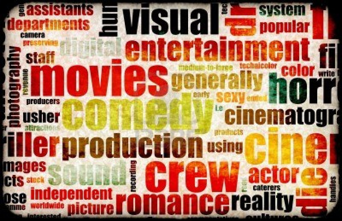
What is Genre?
The purpose of Genre is to let the audience know what type of movie a production is. There are 12 types of Genre's such as Action, Horror, Comedy and so on. There are also Sub-Genre's which are a cross between two Genre's. For example Transformers can be considered as a Sub-Genre as it is known to be a Sci-Fi/Action movie. My favourite type of Genre is Thriller. This is because it is easy to stay engaged and focused as it keeps you gripped. The movie above is called 'The Call' starring Halle Berry and the trailer alone shows why it is a thriller. This is a perfect example of this specific Genre as it keeps you gripped from beginning to end.
Analysis of 2 film title sequences
Narcos (2015)
Immediately we are shown an ident, we learn "Narcos is presented by "Gaumont International Television" , a distribution and production company. This ident is presented over a moving image of what we can assume is a tape recorder, or some sort of VHS device, which immediately hints at the possible genre of the show. Additionally, after that particular shot, comes a zoom in close up of a location on a map. Both moving image shots strongly hint at the show having crime and thriller conventions, both shots suggesting aspects of law and law breaking are present throughout the show. This idea is backed up by the next shot of what can assume to be the spilling of the narcotic - crack cocaine on a backdrop of writings and diagrams on a blackboard, that appear to be a breakdown of the molecular structure of a particular "Substance". Essentially 10 seconds into the sequence, the audience would've already figured out that show is either about or has themes of drug use/distribution/production. For about 20 seconds after that, the title sequence credits the show's key actors on different backdrops relating to the crime genre of the show, as well as the show's directors and producers. The font of the credits is a simplistic, classic font in an off-white colour (another hint at themes present in the show), which is usually on top of a backdrop of either a still image, or a segment of footage which adds in with the shows codes and conventions. Throughout the entire title sequence, a Latin American, slow/romantic style instrumental plays, ever more adding to the already obvious clues to the show's content. The Hispanic style of music ties in with the footage of the use of one of Latin America's (and the world's) most infamous narcotics (at the start of the sequence), so we even get an idea of the locations involved. The title of the show is then presented at the very end of the title sequence in a large bold font over a moving picture of what we assume is the location of the show.

Hackers (1995)
"Hacker"'s title sequence very interestingly, and unlike "Narcos" begins with short footage of the actual film itself, rather than any sort of credits. For the first minute the sequence exposes what we can assume to be the immediate plot of the film. It then proceeds to cut to a black screen, and present the very first ident (which we understand to be "United Artist Pictures") in a bold white font in all caps. After this it resumes to more footage of the film as the credits appear and fade in the same font, whilst a techno song which builds slow and speeds up plays in the background, linking with the film's computerese themes.

Immediately we are shown an ident, we learn "Narcos is presented by "Gaumont International Television" , a distribution and production company. This ident is presented over a moving image of what we can assume is a tape recorder, or some sort of VHS device, which immediately hints at the possible genre of the show. Additionally, after that particular shot, comes a zoom in close up of a location on a map. Both moving image shots strongly hint at the show having crime and thriller conventions, both shots suggesting aspects of law and law breaking are present throughout the show. This idea is backed up by the next shot of what can assume to be the spilling of the narcotic - crack cocaine on a backdrop of writings and diagrams on a blackboard, that appear to be a breakdown of the molecular structure of a particular "Substance". Essentially 10 seconds into the sequence, the audience would've already figured out that show is either about or has themes of drug use/distribution/production. For about 20 seconds after that, the title sequence credits the show's key actors on different backdrops relating to the crime genre of the show, as well as the show's directors and producers. The font of the credits is a simplistic, classic font in an off-white colour (another hint at themes present in the show), which is usually on top of a backdrop of either a still image, or a segment of footage which adds in with the shows codes and conventions. Throughout the entire title sequence, a Latin American, slow/romantic style instrumental plays, ever more adding to the already obvious clues to the show's content. The Hispanic style of music ties in with the footage of the use of one of Latin America's (and the world's) most infamous narcotics (at the start of the sequence), so we even get an idea of the locations involved. The title of the show is then presented at the very end of the title sequence in a large bold font over a moving picture of what we assume is the location of the show.
Hackers (1995)
"Hacker"'s title sequence very interestingly, and unlike "Narcos" begins with short footage of the actual film itself, rather than any sort of credits. For the first minute the sequence exposes what we can assume to be the immediate plot of the film. It then proceeds to cut to a black screen, and present the very first ident (which we understand to be "United Artist Pictures") in a bold white font in all caps. After this it resumes to more footage of the film as the credits appear and fade in the same font, whilst a techno song which builds slow and speeds up plays in the background, linking with the film's computerese themes.

The analysis of two title sequences.
The first title sequence I looked at was Raging Bull - Raging Bull (1980) — Art of the Title
The first thing that showed was a black backboard with the IDENT merging together to come across the middle of the screen. After this the production company reveals the movie is a 'Robert Chartoff-Irwin Winkler' production. A calm Violinist plays an instrumental in the background as 'Robert De Niro' is shown letting us know he is the main character. The key thing to note here is that the main character has been introduced BEFORE the name of the film and not after which is normally the case. A clip is then shown of a boxer (most likely to be Robert De Niro) as he jumps up and down on his feet while he swings a few punches to the air. More credits are shown alongside the clip revealing the actors/actresses stage name alongside their real name. This is something we don't see often in this day and age. The credits carry on as the boxer appears to be jogging up and down in slow motion while he carries on punching the air practising his moves. Maybe he's preparing for a fight. The first scene is then set up as an introduction of the place and date is shown.
The second title sequence I analysed was Narcos - Narcos (2015) — Art of the Title
This title sequence was very different in comparison to Raging Bull as it was shorter in length and the title sequence of Narcos starts off with a type of Casino style instrumental. The first thing to be shown was the production company along with the credits. This was shown while a variety of clips relating to the show was shown. Money, girls and cocaine were all shown in the background while the clips were shown. This is a relevant point because it shows engagement with the audience from the start as this hints what sort of things will be included in the show and give the audience a fill of what the show is about.
What makes a good title sequence according to Kyle Cooper?
Kyle Cooper is arguably one of the most infamous title sequence designers in Hollywood right now. He has been known to be responsible for "revitalising the modern title sequence". He is credited with creating the very memorable title sequences of such action films and thrillers as; "Dawn of the dead", "Se7en", and "Spider man", and has even created title sequences for renowned American TV shows such as "American Horror Story" and "The Walking Dead". Its without saying that cooper is undoubtedly a man of experience in the field of title sequences, so naturally, his opinion on what makes an effective title sequence, is one of relevance.
Cooper believes a well designed title sequence should succeed in being able to "flow seamlessly into the actual film", implying simply that a title sequence should make sense, and fit in with the rest of the movie, depicting the film's genre, code and conventions throughout it.
As well as this he claims it should clearly set an expectation on what the film is actually about (and overall genre), and what the audience can assume from it.
Additionally he goes on to preach the importance of an stimulating and non tedious title sequence, that should always get the audience excited about the actual movie (or TV show), without giving too much of the plot away.
 "American Horror Story" (2011)
 |
| "Dawn of the Dead" (2004) |
Friday, 9 October 2015
What is Genre?
Genre
Genre is used in in all films as a way to categories different types of films that focus on one area. Media uses 12 or more types of genres in media such as western, action etc... Genres can also be hybrid meaning two genres come together to create another film. films like Paul the movie is a hybrid as it is a sci-fi/ action adventure movie therefore two genres have come together.
The three main importance of genre in film is:
- Used to engage their target audience
- it is used to separate films into groups; different main characters and atmospheres.
- Genres also attract different types of people therefore can provide profit for other things like memorabilia, costumes and sequels to the films.
Title sequence and film opening
Purpose
The purpose of having a title sequence and film opening is mainly to set the atmosphere for the film ahead. However, there are many other types of opening sequences that use many features the sound and photos included are used to set the genre.
The Main purposes of a tile sequence:
The Main purposes of a tile sequence:
- To introduce the characters to the audience
- To set the tone and atmosphere of the film by using sound or photos
- It will also introduce the genre to the audience so they can identify with the film before it starts
Title sequences uses four different categories which are:
- Tiles/credits on a blank screen...Thus creates a high contrast and is very simple to produce and look at; includes a institutional information.
- Titles/credits on a still image...Its is more elaborate to the blank screen and gives a good hint or tone to the genre of the film. it accompanies the creditis to make the title sequence longer.
- Titles/credits over moving images...It can be used for a metaphor or narrative thread.
- Tiles/credits using animation or motion...It uses digital and stylized editing for the title sequence.
Analyse 2 film title sequences
Honey i shrunk the kids
This title sequence is well designed animation for the film. The animation introduces all the characters who have been transformed into animation. This type of animation can be uses in many genres.
Seven
The title sequence seven genre is horror, this title sequence is very famous as it was produced by kyle copper. The sequence uses hand written credits which suits the atmosphere, it is not clean and the title are intentionally made to look rough. As it is a horror the picture of blood, dirt and horror images fit in with genre.
Audience profiles for films
Audience profiles for films
 The film that this audience is inked to is called Mama Mia, this film is very well known film. I found out that the main people to watch this film was women aged 55+. The demographic of the woman is that the person to watch this film will mostly have an importance to faith and doesn't like to
 What makes a good title sequence according to kyle cooper?
Kyle cooper
Kyle copper is a leading title sequence designer who has revolutionised title sequence production as an art form. Some of his most famous title sequence designs are the movies seven, spider-man and flubber. As a kid kyle cooper was inspired by films when he was a child; to kill a mocking bird was one of his favourite title sequences as he enjoyed the photographs of the film, also the contrast of the circle objects against the horizontal lines.Another one of coopers favourite title sequences as a kid was Deadzone. These title sequences inspired cooper to design title sequences as a job.
According to kyle cooper the following things make a good title sequence:
- If the title sequence tales seamlessly into the film it will draw the audience in more.
- The title sequence has to engage the audience by using interesting features. The title sequence from the film seven that kyle copper produced included interesting features such as the credits were hand written rather than computer produced
- finally, the title sequence has to set the tone and atmosphere of the film to make a successful title sequence.
The importance of Sound in film
Sound is used to establish tone and atmosphere. This helps to give the audience a clue about what happening with the plot and characters. It also reveals
Audience profiles for films
The research for the audience of the film Skyfall:
Skyfall is a action film and attracts adults. The audience of the film is particularly male and from London and Central Scotland. The age range of the audience is between 40-54. Upper and middle class men are likely to watch this film. Also, they usually support right wing politics. their favourite films include Casino Royale and Goldeneye. This audience reads the newspaper 'Times' the most and their professions are Engineering and Military. Below shows the brands these consumers are likely to buy:
 The research for the audience of film Avatar:
 The audience who watch the film Avatar are mainly male, aged 40-54 and from Wales or Yorkshire. The clothing brands they buy the most are Nike, Vans and Converse. Also, they shop at Morrisons the most. This audience reads the Daily Star newspaper the most. In addition this audience watches TV for 40-56 hr per week.
The research for the audience of Casino Royale:
Casino Royale is a action film that is mainly watched by adults. it's main audience are Males mostly from East Anglia. Also, many of the audience support right wing politics. Also, they are customers of Tesco Petrol, Sainsbury's and Sony. In addition, these people have watched other films such as Quantum of Solace.
Audience profiles for Films

The first research I did was on Transformers: Dark of the Moon. I found out that the main people who watch this film are men ages 40-54 who like to spend their free time relaxing and are television addicts. This helps film producers know who their target markets are and lets them analyse their audiences in more dept. Below shows the brands the audience are most likely to consume. This includes things such as Nintendo and Apple Mac which help the film makers to know what sort of merchandise they should produce for their audience.

The second research I did was on the genre of action and the film was Wolverine. The target audience is males aged 18-24 who are working class and have an interest in video games and watching TV. These men are most likely to be right wing and have the type of personality where they want to help the World be a better place.

Thursday, 8 October 2015
What is Genre?
Genre is used in Media to categorize different sort of media forms so the audience know what they are watching. Film makers also look at what genre is popular at the time and take this into consideration when making a movie. There are also sub-genres which means a specific genre in a genre. For example, in the genre of horror, a sub horror could be Sci-Fi or Gory.
 This picture shows a gangster movie. I know the genre for this is gangster because of the scene layout. There is money, cards and alcohol on the table while one of the characters have a gun in his hand. Another giveaway is the fact that the men are wearing suits. Most gangsters wear suits when they do what they consider to be 'business'. The lighting can also reveal what type of genre the film is, most gangster films tend to have bright lighting in tense scenes which keeps the audience intrigued.
This picture shows a gangster movie. I know the genre for this is gangster because of the scene layout. There is money, cards and alcohol on the table while one of the characters have a gun in his hand. Another giveaway is the fact that the men are wearing suits. Most gangsters wear suits when they do what they consider to be 'business'. The lighting can also reveal what type of genre the film is, most gangster films tend to have bright lighting in tense scenes which keeps the audience intrigued.  beteh
betehWednesday, 7 October 2015
What is Genre?
Genre is a sort, category or kind of a film or musical work. An example of a film genre could be 'Horror.' Genre allows the audience to categorise media products. Also, it allows film producers to make decisions on their researching, planning and making of how their film would be. Genre evolves and changes over time and this may lead to hybrids or new genres. We get to realise what sort of genre a film is just by looking at a screenshot of it. This is because the characters, costumes, props, the setting and even climate could show what the film involves. These are generic signifiers(tropes). Overall, genre helps the audience find films that are in their own interest and helps film producers to produce films that are targeted for the specific target market.
Analysed Genres: the following 3 images are screenshots of different films:
 My first impression is that this film has a 'Gangster' genre. This is because it contains props and characters who are usually associated with gangster films. For example, it contains guns and alcohol. Also, the male characters seem to be very masculine and their body language suggests that they are violent. Also, gambling and card games are usually associated with gangster films.

I think this films genre is 'action.' This is because one of the characters are flying over to another vehicle. Also, the cars are sport cars which suggest that they are travelling at a high speed. There is a tank which shows there is action in the film.
Analysed Genres: the following 3 images are screenshots of different films:


I think this films genre is 'action.' This is because one of the characters are flying over to another vehicle. Also, the cars are sport cars which suggest that they are travelling at a high speed. There is a tank which shows there is action in the film.

Genre
Genre is a very significant aspect of media in general. All films will have a certain genre that the film makers will have to follow. It allows the film producers to sift out aspects of the film that aren't wanted or needed, as well as allowing them to decide what kind of conventions they should spend their funds on. Different genres will always have very different codes and conventions, which is essentially what separates one genre from another. Conventions can be identified simply as one or more recognisable or infamous conventions associated with that particular genre, e.g. - females being terrorised by an intimidating (we assume) male character in horror films, or even a couple (usually heterosexual) who would otherwise be completely unpalatable, falling helplessly in love with each other - insinuating the idea of "opposites attract" in romantic comedies.
 "Scream 4" (2011)
"The Ugly Truth" (2009)
"Scream 4" (2011)
"The Ugly Truth" (2009)
 In a title sequence, a genre is very easily distinguishable, usually it can be given away by different conventions such; the font of the writing, or the colours used in it. Especially in a movie's title sequence, the codes and conventions used will help build expectations for the genre of film in question. Genres also play a significant role is creating preferences and personal tastes for consumers (audiences).
 "Se7en" (1995)
 "Scream 4" (2011)
 In a title sequence, a genre is very easily distinguishable, usually it can be given away by different conventions such; the font of the writing, or the colours used in it. Especially in a movie's title sequence, the codes and conventions used will help build expectations for the genre of film in question. Genres also play a significant role is creating preferences and personal tastes for consumers (audiences).
  "Se7en" (1995)
Tuesday, 6 October 2015
Conclusion about titles credits used in the sequence
 The title credits should be about 2-3 seconds and may also depend on the music used. For example, if a high tempo music is playing we expect the title credits to be on the screen for less. Usually the names of the characters are the first to appear in the sequence and then followed by the producers names. The last name is usually the directors. The font style is usually simple because it should be understandable. Also, the type of credits used should depend on the genre of the film. For example, for a horror movie, credits that fade and look creepy will be the most appropriate. This is because if credits don't combine well with the scenes then it will look odd.
This credit from the 'American Horror Story' suits very well with its genre. The lighting is very effective and clearly the dark background reflects fear and silence. In addition, this is a very simple credit and i know simple and red coloured credits could be very effective especially in horror movies because it causes nervousness as the audience doesn't know what is going to appear on the screen.
Analysis of 2 film title sequences
Manhattan (2014) — Art of the Title
Manhattan: This film opening was made up of animation title sequences. It was stylish and different. It usually had white background and black text. the first credits were the names of the characters and the last credit was the name of the creator. The music suggested that the film was thrilling because it was fast and the pitch was high. The text moved with the music, this is because the credits were moving fast because the tempo of the music was fast. There wasn't a particular story or plot but it involved action. For example there was plans and maths in the title sequence. Overall, the opening could be said to be simple and fast.
Chasing Shakespeare (2013) — Art of the Title
Chasing Shakespeare: This title sequence should be considered to have a theme of thriller. This is because the natural images produced are all interaction and combining with the music and effects. For example, as the music pitch increased the movement of the objects like the horse moved fat as well. Also, there was little fast motion but a lot of slow motion. This depended on the tempo and pitch of the music.Overall, the title sequence was white text with moving images. There was also many effects like the wind and rain effect. These effected the impression on the film because it created a horror theme. It contained fast and slow moving horses which suggested the film might be about a horse. The first credits were the names of the producers and the last was the name of the director. Overall, it was simple and very quality.
4 different types of title sequence
The 4 different types of title sequences:
Titles on black screen: usually white text on black background. this creates a high contrast and it is very cheap. also, it is considered to be simple and uncomplicated.
Titles on still images: more elaborate than simple white text and may hint the tone or genre. Also, it may combine different types of media. In addition, it involves music which may introduce the theme.
Titles on moving images: It may introduce the tone and looks very different to the others. Also, combines really well with music.
Titles using animation or motion: requires digital technology and very stylised editing. Also, may be expensive.
I prefer titles using animation or motion(stylised) because it is more unique and very modern compared to the other title sequences. Also, it does not require the exact plot or setting, therefore it will make the audience make an impression without knowing much of the film. Also, it is really affective if music or different colours are combined with the animation. However, it involves digital technology which may take a little more time and may be more expensive tan other titles.
I believe that the title sequence for the Skyfall film was successful because it included animation. I think the combination of the music and action was phenomenal.
What makes a good title sequence according to to Kyle Cooper?
Kyle Cooper is accredited with revolutionising title design. Kyle Cooper thinks the following features make a title sequence successful. He thinks that the title sequence should flow into the film. This means that the title sequence should relate to the film. He thinks it should also, make the audience excited. This will happen if it catches the audiences attention. In addition, he thinks a title sequence should set a tone and an expectation from the audience. This means it should immediately make an impression for the actual film. Overall, Kyle Cooper thinks title sequences should get the audience ready into the film.
Prelim analysis
I found my prelim film very successful because we achieved to get 9-10 shots. Our film was about a wig in a Doctors waiting room. I acted out a patient’s role and had different angled shots taken at me. We planned out our story and shot types on a storyboard. This was very useful because we drew the actual image and got a sense of what we will be doing from the start. This was useful because we were very well organised when it came to film. We worked as a team and this built confidence amongst us. When filming, we avoided any kind of interruption especially during the acting. We edited the film at the end together. This was good because we got ideas from everyone in the group. Also, we managed to edit the match cutting in particular very well and on the spot. I believe we were successful because we didn't break the 180 degree rule, used shot/reverse shot and performed match cuts. In addition, we included dialogue, character opening door, and characters sitting and crossing a room. The thing that may have not gone well in the completed film is that we may be able to have added a few more shots and match cuts. Another thing that dint go as expected was the ending, we could have spend more time on the ending. Also, we could of added music to our film and may have even added a few lines of dialogue. If I had to change and improve my film now i would add more dialogue, match cuts, different types of shots and more reverse shot. I thought that the storyboard really helped us getting organised and well prepared before filming. Also, it helped when editing because we got the right actions in the right order. Overall, I believe that our prelim film was successful because we managed to film match cuts, reverse shots and never broke the 180 degree rule.
What makes a good title sequence according to Kyle Cooper?
Kyle Cooper has directed over 150 title sequences and is known for 'revolutionizing' the way in which title sequences are now made. Cooper says a title sequence is successful if it gets us (the audience) excited, if it jumps straight into the movie and if it helps to set the tone. He also believes the best title sequences should portray a back story before the movie itself has even started, sort of like a prologue. This helps the audience to slowly ease into the film and engage. Cooper believes this will also give us additional information which will benefit us later down the film.
What is the purpose of a title sequence and opening?
A title sequence is used to do many things. A title sequence can be used to set the tone/feeling and to introduce the film's genre. In most film's, one of the first things the title sequence will show is the IDENT. This informs the audience of what production company was used to produce that particular movie. Many title sequences also inform the audience of who is starring in the film. In my opinion the main reason for a title sequence is to set the tone for the audience and give them a feel for what is happening or what is going to happen. If done well, it makes the audience feel as if they are involved and they become more attached, it allows them to be engaged from the start.
Friday, 2 October 2015
Purpose of Title sequene
The purpose of a tile sequence before a film begins, is that it gives a glimpse of what the plot and genre of the film is going to be about to the audience. This is created by the affect of sound, weather and colour that creates a impression from the start. Also, it introduces the theme, location, characters, producers of the film and the Ident(production). Therefore, title sequences portray the tone of the film through these aspects. For example, the weather could be used in the form of creating a type of genre.
Thre of the film is going to be about to the audience. This is created by the affect of sound, weather and colour that creates a impression from the start. Also, it introduces the theme, location, characters, producers of the film and the Ident(production). Therefore, title sequences portray the tone of the film through these aspects. For example, the weather could be used in the form of creating a type of genre.

Subscribe to:
Posts (Atom)